Contents
15 May 2025 • 20:40
In this article, we demonstrate how to build an LSTM (Long Short-Term Memory) model to forecast Bitcoin prices using historical market data.
The goal is to explore the potential of deep learning in capturing time-series trends in cryptocurrency markets.
We will use TensorFlow to build the LSTM model, yfinance to download historical Bitcoin data, and Scikit-learn to evaluate the model's performance.
Visualizations will help us interpret model training and prediction outcomes.
To begin, install the required Python libraries in a new jupyter notebook cell:
Python
%pip install numpy pandas matplotlib scikit-learn tensorflow yfinance tabulateWe import all the necessary modules for data preprocessing, modeling, and visualization:
Python
# Importing Required Libraries
import numpy as np
import matplotlib.pyplot as plt
from sklearn.preprocessing import MinMaxScaler
from tensorflow.keras.models import Sequential
from tensorflow.keras.layers import Dense, LSTM
from sklearn.metrics import root_mean_squared_error, mean_absolute_error, r2_score
import yfinance as yf
from tabulate import tabulate

plt.style.use('dark_background')We download the historical Bitcoin data from Yahoo Finance. The data includes daily open, close, high, low, and volume values:
Python
# Load latest data for simulation
df = yf.download("BTC-USD", start="2010-07-17", end="2025-05-08", auto_adjust=True)
df.columns = df.columns.get_level_values(0)
df = df[['Open', 'Close', 'Volume', 'Low', 'High']]
df.head()We visualize the closing price of Bitcoin over time:
Python
# Visualize the closing priceng price
plt.figure(figsize=(14, 6))
plt.plot(df['Close'], label='Bitcoin Price', color='orange')
plt.title('Bitcoin Price Over Time')
plt.xlabel('Date')
plt.ylabel('Price (USD)')
plt.legend()
plt.grid()
plt.savefig('bitcoin_price.png', dpi=300)
plt.show()
Bitcoin Closing Price Chart from 2010 to 2025
We select the Close price as the target feature:
Python
# Select the feature we want to forecast (e.g., 'Close' price)
data = df['Close'].values.reshape(-1, 1)
We normalize the data to ensure all values fall between 0 and 1:
Python
# Normalize the data
scaler = MinMaxScaler(feature_range=(0, 1))
scaled_data = scaler.fit_transform(data)
We split the data into training and testing sets:
Python
# Split data into training and testing sets
train_size = int(len(scaled_data) * 0.8)
train_data = scaled_data[:train_size]
test_data = scaled_data[train_size:]We prepare the input sequences to feed into the LSTM model:
Python
# Function to create sequences for LSTM input
def create_sequences(data, seq_length):
    sequences = []
    labels = []
    for i in range(len(data) - seq_length):
        sequences.append(data[i:i + seq_length])
        labels.append(data[i + seq_length])
    return np.array(sequences), np.array(labels)

# Create sequences
sequence_length = 50
X_train, y_train = create_sequences(train_data, sequence_length)
X_test, y_test = create_sequences(test_data, sequence_length)

# Reshape input to be 3D [samples, time steps, features]
X_train = np.reshape(X_train, (X_train.shape[0], X_train.shape[1], 1))
X_test = np.reshape(X_test, (X_test.shape[0], X_test.shape[1], 1))We define and compile a simple two-layer LSTM model:
Python
# Build the LSTM model
model = Sequential()
model.add(LSTM(units=50, return_sequences=True, input_shape=(X_train.shape[1], 1)))
model.add(LSTM(units=50, return_sequences=False))
model.add(Dense(units=25))
model.add(Dense(units=1))

# Compile the model
model.compile(optimizer='adam', loss='mean_squared_error')We train the model over 50 epochs using a batch size of 32:
Python
# Train the model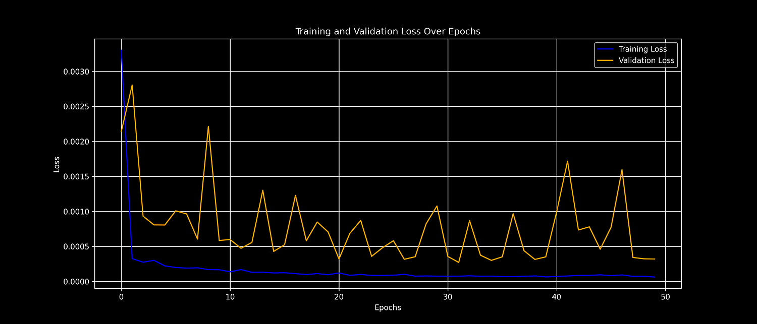
history = model.fit(X_train, y_train, batch_size=32, epochs=50, validation_data=(X_test, y_test))We plot the training and validation loss to observe model performance over time:
Python
# Plot training and validation loss
plt.figure(figsize=(14, 6))
plt.plot(history.history['loss'], label='Training Loss', color='blue')
plt.plot(history.history['val_loss'], label='Validation Loss', color='orange')
plt.title('Training and Validation Loss Over Epochs')
plt.xlabel('Epochs')
plt.ylabel('Loss')
plt.legend()
plt.grid(True)
plt.savefig('loss_plot.png', dpi=300)
plt.show()
Training and Validation Training Loss Chart
We make predictions using the trained model and reverse the normalization:
Python
# Make predictions
train_predictions = model.predict(X_train)
test_predictions = model.predict(X_test)

# Inverse transform predictions and actual values
train_predictions = scaler.inverse_transform(train_predictions)
y_train_actual = scaler.inverse_transform(y_train.reshape(-1, 1))
test_predictions = scaler.inverse_transform(test_predictions)
y_test_actual = scaler.inverse_transform(y_test.reshape(-1, 1))We define a helper function to calculate RMSE, MAE, and R² metrics:
Python
# Define a helper to compute metrics
def evaluate(y_true, y_pred):
    rmse = root_mean_squared_error(y_true, y_pred)
    mae = mean_absolute_error(y_true, y_pred)
    r2 = r2_score(y_true, y_pred)
    return rmse, mae, r2

# Evaluate both train and test sets
train_metrics = evaluate(y_train_actual, train_predictions)
test_metrics = evaluate(y_test_actual, test_predictions)

# Display results using tabulate
headers = ["Dataset", "RMSE", "MAE", "R² Score"]
rows = [
    ["Train"] + [f"{m:.2f}" for m in train_metrics],
    ["Test"] + [f"{m:.2f}" for m in test_metrics],
]
print(tabulate(rows, headers=headers, tablefmt="grid"))
This outputs the following performance metrics:
Plaintext
+-----------+---------+---------+------------+
| Dataset   |    RMSE |     MAE |   R² Score |
+===========+=========+=========+============+
| Train     |  946.23 |  605.68 |       1    |
+-----------+---------+---------+------------+
| Test      | 1898.35 | 1390.88 |       0.99 |
+-----------+---------+---------+------------+Train Set
RMSE: $946 — predictions are off by about 946 on average.
MAE: $606 — average absolute error is fairly low.
R²: 1.00 — perfect score, likely due to overfitting on training data.
Test Set
RMSE: $1,898 — higher error on unseen data, as expected.
MAE: $1,391 — still within a reasonable range given Bitcoin’s price swings.
R²: 0.99 — the model explains 99% of the variance, which is very strong.
In Short:
The model fits the training data very well.
It generalizes surprisingly well to the test set, despite Bitcoin’s volatility.
A 0.99 R² on test data is an excellent result in a real-world forecasting task like this.
Finally, we visualize the actual and predicted Bitcoin prices:
Python
# Plot predictions vs actual values
plt.figure(figsize=(14, 6))
plt.plot(df.index[sequence_length:train_size], y_train_actual, label='Train Actual')
plt.plot(df.index[sequence_length:train_size], train_predictions, label='Train Prediction')
plt.plot(df.index[train_size+sequence_length:], y_test_actual, label='Test Actual')
plt.plot(df.index[train_size+sequence_length:], test_predictions, label='Test Prediction')
plt.title('Bitcoin Price Forecasting')
plt.xlabel('Date')
plt.ylabel('Price (USD)')
plt.legend()
plt.grid()
plt.savefig('predictions_plot.png', dpi=300)
plt.show()
LSTM Model Predictions Chart
You can access the full code and related resources on my GitHub repository.
We have successfully built an LSTM model to forecast Bitcoin prices using historical market data.
The model captures temporal patterns in the price movement and provides a solid foundation for experimenting with other cryptocurrencies or advanced forecasting techniques.
This example can serve as a base for further fine-tuning and feature engineering to improve prediction accuracy or build more robust trading systems.


